Text FormattingText Doesn't Look Good

Information and discussion about LaTeX's general text formatting features (e.g. bold, italic, enumerations, ...)
Post Reply
smallslovak
Posts: 2
Joined: Sat Jul 09, 2016 1:25 pm

Text Doesn't Look Good

Post by smallslovak »

Good morning

I have some problems and I can't find out answers. I need your help.

1. Why does text look so bad? Why isn't text normal?

Code: Select all

\documentclass[slovak]{article} % - I tried book but result is the same
\usepackage[T1]{fontenc}
\usepackage[utf8]{inputenc}
\usepackage{babel}
\usepackage{tipa}
\usepackage{mathptmx}
\usepackage[a6paper, top=10mm, left=10mm, right=10mm]{geometry} % paper format

\begin{document}

\LARGE
\input{ADJ_NEW.txt}  % file of text 

\end{document}
ADJ_NEW.txt
Source file - text
(67.12 KiB) Downloaded 169 times
Result.
Result.
picture_1.jpg (80.57 KiB) Viewed 2541 times
2. When I tried using longtable text looks good but the text is just on one page.

Code: Select all

\documentclass[slovak]{article}
\usepackage[T1]{fontenc}
\usepackage[utf8]{inputenc}
\usepackage{babel}
\usepackage{tipa}
\usepackage{mathptmx}
\usepackage{longtable}
\usepackage[a6paper, top=10mm, left=10mm, right=10mm]{geometry}

\begin{document}

\LARGE
\begin{longtable}{p{80mm}}
\input{ADJ_NEW.txt}
\end{longtable}

\end{document}
ADJ_NEW.txt
Source file - text
(67.12 KiB) Downloaded 169 times
Result 2
Result 2
picrure_2.jpg (68.88 KiB) Viewed 2541 times
Thank You For Your Help
Last edited by cgnieder on Wed Jul 13, 2016 10:25 am, edited 1 time in total.

Recommended reading 2024:

LaTeXguide.org • LaTeX-Cookbook.net • TikZ.org

NEW: TikZ book now 40% off at Amazon.com for a short time.

And: Currently, Packt sells ebooks for $4.99 each if you buy 5 of their over 1000 ebooks. If you choose only a single one, $9.99. How about combining 3 LaTeX books with Python, gnuplot, mathplotlib, Matlab, ChatGPT or other AI books? Epub and PDF. Bundle (3 books, add more for higher discount): https://packt.link/MDH5p

Johannes_B
Site Moderator
Posts: 4182
Joined: Thu Nov 01, 2012 4:08 pm

Text Doesn't Look Good

Post by Johannes_B »

You are running into a problem of typography. Narrow columns. Both of your examples are bad, really bad. Don't you notice the large gaps in your second example? The only sane solution is using \raggedright in your preamble.
The smart way: Calm down and take a deep breath, read posts and provided links attentively, try to understand and ask if necessary.
User avatar
Stefan Kottwitz
Site Admin
Posts: 10335
Joined: Mon Mar 10, 2008 9:44 pm

Text Doesn't Look Good

Post by Stefan Kottwitz »

Generally, microtype can help:

Code: Select all

\usepackage{microtype}
But the main issue here is that you need hyphenation because of the narrow columns, but how should LaTeX hyphenate this?

\textipa{@\textprimstress dO:.r@.b\super @l}

You can add possible hyphenation points though:

\textipa{@\textprimstress dO\-:.r@\-.b\super @l}

You may change the encoding from T1 to IL2, if this would show improvement:

Code: Select all

\usepackage[IL2]{fontenc}
You may play with such values in your preamble:

Code: Select all

\tolerance 1200
\hbadness 1200
\emergencystretch 0.8em
\hfuzz 0.3pt
\widowpenalty=10000
Similar it's mentioned in the \sloppy section in l2tabu.

Example:

Code: Select all

\documentclass[slovak]{article} % - I tried book but result is the same
\usepackage[IL2]{fontenc}
\usepackage[utf8]{inputenc}
\usepackage{babel}
\usepackage{tipa}
\usepackage{mathptmx}
\usepackage[a6paper, top=10mm, left=10mm, right=10mm]{geometry} % paper format
\usepackage{amsmath}
\tolerance 1200
\hbadness 1200
\emergencystretch 0.8em
\hfuzz 0.3pt
\widowpenalty=10000
\usepackage{microtype}
\begin{document}
\LARGE
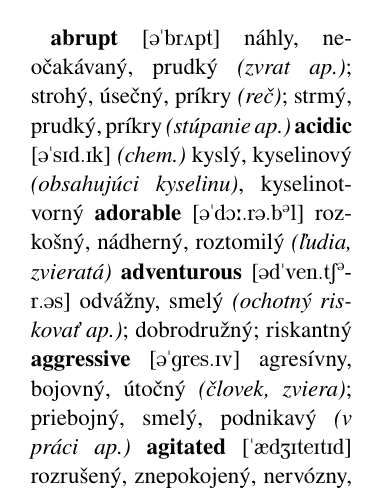
               \textbf{abrupt}                                               [\textipa{@\textprimstress br2pt}]           náhly, neočakávaný, prudký \textit{(zvrat ap.)}; strohý, úsečný, príkry \textit{(reč)}; strmý, prudký, príkry \textit{(stúpanie ap.)} 
               \textbf{acidic}                                              [\textipa{@\textprimstress sId.Ik}]           \textit{(chem.)} kyslý, kyselinový \textit{(obsahujúci kyselinu)}, kyselinotvorný 
             \textbf{adorable}                                   [\textipa{@\textprimstress dO:.r@.b\super @l}]           rozkošný, nádherný, roztomilý \textit{(ľudia, zvieratá)} 
          \textbf{adventurous}                                 [\textipa{@d\textprimstress \-ven\-.tS\super @\-r.@s}]           odvážny, smelý \textit{(ochotný riskovať ap.)}; dobrodružný; riskantný 
           \textbf{aggressive}                                             [\textipa{@\textprimstress gres.Iv}]           agresívny, bojovný, útočný \textit{(človek, zviera)}; priebojný, smelý, podnikavý \textit{(v práci ap.)} 
             \textbf{agitated}                                        [\textipa{\textprimstress \ae dZIteItId}]           rozrušený, znepokojený, nervózny, vyvedený z miery 
                \textbf{alert}                                                [\textipa{@\textprimstress l3:t}]           ostražitý, bdelý, pozorný 
\end{document}
hyphenation.png
hyphenation.png (82.68 KiB) Viewed 2527 times
Sounds like some additional work to get proper hyphenation with tipa words, but I don't know an automatic solution yet, and your document is a bit special with tipa and narrow columns.

Stefan

PS: Please don't use capital letters for a whole title or text.
LaTeX.org admin
Post Reply