Hi,
TikZ offsers the options
xstep and
ystep when using its grid instruction:
Code: Select all
\tikz \draw (0,0) grid [xstep=.5,ystep=.75] (3,2);
However, your example looks as if you'd like to visualize some (data) plot.
You might be interested in the package pgfplots: it is based on tikz (and offers all of tikz's style options) but it simplifies the generation of plots and suitable axes considerably.
Here is an extract of its meta data:
PGFPlots draws high quality function plots in normal or logarithmic scaling with a user-friendly interface directly in TeX. The user supplies axis labels, legend entries and the plot coordinates for one or more plots and PGFPlots applies axis scaling, computes any logarithms and axis ticks and draws the plots. It supports line plots, scatter plots, piecewise constant plots, bar plots, area plots, mesh-- and surface plots, patch plots, contour plots, quiver plots, histogram plots, polar axes, ternary diagrams, smith charts and some more.
Your example would look as follows:
Code: Select all
\documentclass[a4paper]{article}
\usepackage{pgfplots}
\pgfplotsset{compat=1.7}
\begin{document}
\thispagestyle{empty}
\begin{tikzpicture}[domain=1:9,x=0.4cm,y=0.5cm] % Zeichenbereich
  \draw [color=gray!50,dashed]  [step=2] (0,0) grid (20,12);
  \draw[very thick, -] (0,0) -- (20,0);
  \draw[very thick, -] (0,0) -- (0,12);
  \draw[very thick, -] (0,12) -- (20,12);
  \draw[very thick, -] (20,0) -- (20,12);
  \foreach \x in {0,5,...,20} \draw (\x,0) -- (\x,-0.4) node[below] {\x};
  \foreach \y in {0,2,...,12} \draw (0,\y) -- (-0.5,\y) node[left] {\y};
%  \draw[very thick, color=red] plot[smooth] (\x,{(10)/(1+exp(-0.9*(\x-8)))});
  \draw[thick, color=blue, fill=blue] plot[mark=*, mark options={scale=1.3}] (2,2);
\end{tikzpicture}
\begin{tikzpicture}
\begin{axis}[
xmin=0,
xmax=20,
ymin=0,
ymax=12,
grid=major,
xlabel=$x$ Achse,
ylabel=$y$ Achse,
legend entries={Scatter},
]
\addplot coordinates {(2,2)};
\end{axis}
\end{tikzpicture}
\end{document}
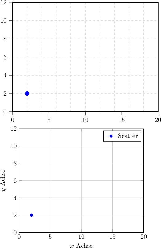
- P.png (23.32 KiB) Viewed 8671 times
Note that the default configuration of PGFPlots results in the same tick marks as your manually tuned example. It also offers the same markers as your selection (otherwise we could have configured them using an option list
\addplot[<options>]). I have also added axis labels and a legend, just to demonstrate the idea.
PGFPlots also allows to reconfigure the appearance of an axis (like dashed grid lines or outer tick marks as in your example). Perhaps a brief look into the example of the
 pgfplots
 manual helps to decide if the package suits your needs.
Disclaimer note: I am author of PGFPlots.
