OK, I see what you mean now. You're right, that excessive vertical space between the bar and the x in the bottom looks bad, especially when combined into a second fraction. Maybe LaTeX's typesetting isn't as "beautiful" as some people think.

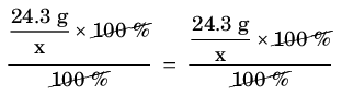
I don't know how to reduce that space; I'll be curious to see if there is a way. But for the problem it creates when using a double fraction, you could use the \vphantom command to add some extra space below the x:
Code: Select all
\dfrac{\dfrac{\text{24.3 g}}{\vphantom{\frac{a}{b}}\mathrm{x}}\times\text{\cancel{100 \%}}}{\text{\cancel{100 \%}}}
~=~ \dfrac{\dfrac{\text{24.3 g}}{\mathrm{x}}\times\text{\cancel{100 \%}}}{\text{\cancel{100 \%}}}
Notice the extra space in the fraction on the left, which I think makes it look a little better than the one on the right:
- fractionspace.png (3.78 KiB) Viewed 5988 times
Still, that excess space above the x is a problem. LaTeX appears to bottom-align the numerator and denominator of a fraction by default, which makes sense. I don't know if there's a way to center-align or top-align, or maybe some other method to change the spacing.
