
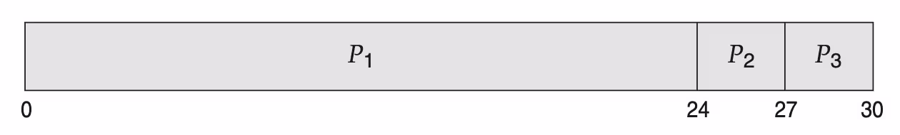
I want to replicate some Gantt charts shown in the book “Operating System Concepts” to demonstrate how CPU scheduling algorithms work, like this one:
I tried to replicate it using the pgfgantt package and this is what I got:
Code: Select all
\documentclass{article}
\usepackage{pgfgantt}

\begin{document}

\begin{figure}
\centering
\begin{ganttchart}[%
inline,
bar inline label anchor=west,
bar inline label node/.append style={anchor=west, text=black},
bar/.append style={fill=white!!black,},
bar height=.8,]{0}{30}
\ganttbar{$P_1$}{0}{24}
\ganttbar{$P_2$}{24}{27}
\ganttbar{$P_3$}{27}{30}
\end{ganttchart}
\end{figure}

\end{document}
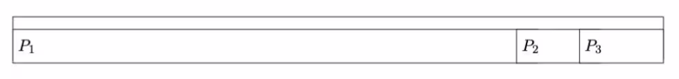
What I want to do (but am unable to despite reading the package documentation) is the following:
- - remove the top white bar
- center the text of the respective blocks
- make sure that the content of the figure does not exceed the allowed area on the page, at the same time keeping the numeric indices I used to define the “length” of each segment
- have numerical indices, just like in the original figure.
