Hi Joey,
I am a little bit uncertain of what "significance stars" are and how they should look.
Nevertheless, the approach to "paint into the graphics" is also possible by means of pgfplots: you can place \draw, \node or \path instructions right into the axis. In order to place the graphical elements, you can rely on the "axis coordinate system"
.
In addition to this (very custom) form, you could use scatter plots in the same axis. Scatter plots just draw some marker at predefined places, and their color and style often comes with reasonable defaults if you write
(which means to use the default styles for that plot and append your own options).
Here is what I got so far. I also took the freedom to play around with the legend:
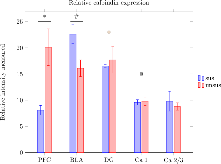
- P.png (18.94 KiB) Viewed 14767 times
Code: Select all
\documentclass{article}
\usepackage{graphicx}
\usepackage[font=small, width=0.6\columnwidth, justification=justified, singlelinecheck=false]{caption}
\usepackage{pgfplots}

\pgfplotsset{width=0.9\columnwidth}

\begin{document}
\thispagestyle{empty}

\begin{figure}[h!]
		\begin{tikzpicture}
		\begin{axis}[
		ybar,
		ymin=0,
		enlarge x limits=0.15,
		legend style={at={(0.5,-0.15)},
		anchor=north,legend columns=-1},
		ylabel={Relative intensity measured},
		symbolic x coords={PFC, BLA, DG, Ca 1, Ca 2/3},
		xtick=data,
		title={Relative calbindin expression},
		%
		% --- CF:
		legend entries={sus,unsus},
		legend style={
			at={(1.02,0.5)}, anchor=west,
			draw=none,
			legend columns=1,
			nodes={anchor=west},
		},
		%nodes near coords,
		%nodes near coords align={vertical},
		]
				\addplot+[error bars, y dir=both, y explicit]
				coordinates {
				(PFC,8.1) +- (PFC,0.9)
				(BLA,22.6) +- (BLA,1.8)
				(DG,16.5) +- (DG,0.3)
				(Ca 1,9.6) +- (Ca 1,0.5)
				(Ca 2/3,9.8) +- (Ca 2/3,1.9)};
				\addplot+[error bars, y dir=both, y explicit]
				coordinates {
				(PFC,20.1) +- (PFC,3.5)
				(BLA,16.1) +- (BLA,1.6)
				(DG,17.7) +- (DG,2.5)
				(Ca 1,9.8) +- (Ca 1,0.8)
				(Ca 2/3,8.8) +- (Ca 2/3,0.7)};
				%\legend{APO-SUS,APO-UNSUS}

				% ---- CF
				\draw (axis cs:PFC,25) ++ (-10pt,0pt) -- ++(20pt,0pt);
				\node[anchor=south] at (axis cs:PFC,25) {*};

				\draw (axis cs:BLA,25) ++ (-10pt,0pt) -- ++(20pt,0pt);
				\node[anchor=south] at (axis cs:BLA,25) {\#};

				\addplot+[only marks,mark=*]
					coordinates {(DG,23)};

				\addplot+[only marks,mark=square*]
					coordinates {(Ca 1,15)};
		\end{axis}
		\end{tikzpicture}
\end{figure}

\end{document}
The legend options contain placement + alignment (which is explained in Section Alignment in the pgfplots manual, although it actually uses stuff from the PGF/TikZ package) and some fine tuning options to align nodes to the left. The draw=none statement is from TikZ; it disables the frame around the legend.
The drawing instructions are plain TikZ. If you want to follow the approach "paint right into the image" (which is fine), you will need to study TikZ (pgfmanual.pdf). I suppose it suffices to read part III of that manual (the part explaining TikZ); it describes path commands and nodes which is what you need here.
The scatter-plot approach using only marks is plain pgfplots, but of course, this relies on plot marks which are less customizable compared to plain graphics instructions.
Kind regards
Christian