I have the following diagram that is a binned frequency histogram. However, I am trying to convert it from a python matplotlib diagram to include into Latex. The way I do this is the same way I have done for many other diagrams.
The diagram looks like this:
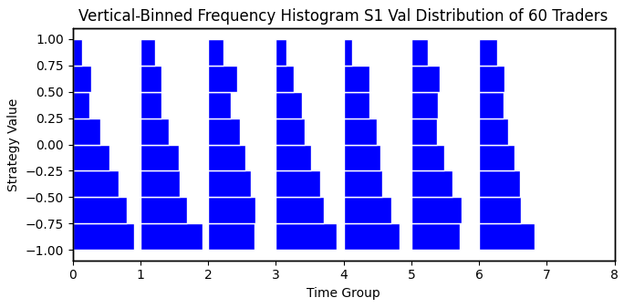
- BinnedHistogram.png (22.6 KiB) Viewed 3647 times
Each of the 'columns' contains a histogram. Since the y-axis is printed each time for each histogram, the values are superimposed on each other so the y-axis looks clean as it should. However, the problem is that when I put the pgf file in overleaf and print the figure it looks like this:
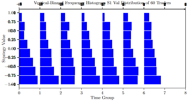
- WeirdBinnedHistogram.png (31.24 KiB) Viewed 3647 times
As I mentioned, each of the values that appear in bold and confusing are so because they are being printed for each of the histograms. My question is: how can I remove the bolding on the y-axis and completely remove the top xticks? I have the xticks that are clean on the bottom x-axis, I don't need another.
I am sharing my pgf file and I hope that you can help out!
Attachment: